
How Modern Website Design Builds Trust and Increases Sales
Design is not decoration — it is the silent language your website uses to earn (or lose) trust in seconds. Here is how modern design quietly turns visitors into paying customers.
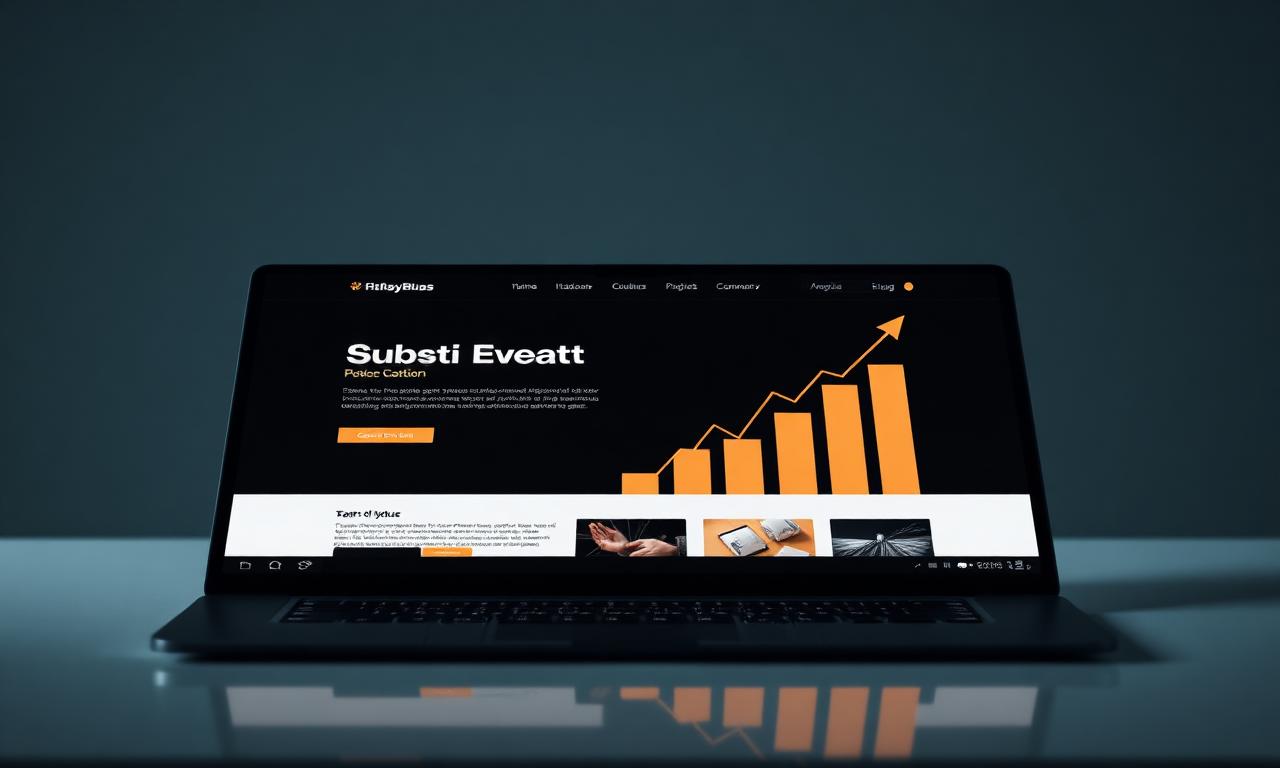
Every visitor lands on your website with one question running in the back of their mind: can I trust these people? Modern design answers that question before they have read a single sentence — and the businesses that understand this are quietly outselling competitors with bigger budgets and better products.
Trust is a visual decision before it is a logical one
Stanford research found that 75% of users judge a company's credibility based on website design alone. That judgement happens in roughly 50 milliseconds — long before a visitor evaluates your services, pricing or proof.
What feels like a gut reaction is actually a cluster of fast signals: clean hierarchy, balanced spacing, considered typography and consistent branding. When those signals align, the visitor's nervous system relaxes and they start reading. When they don't, the back button wins.
“Your design is the first promise you make. Every other promise on the page is judged against it.”
The psychology behind modern layouts and branding
Modern layouts work because they respect how humans actually read screens. Visitors scan in predictable patterns — they zig-zag down the page, anchor on bold headlines and skip blocks of dense text. Premium design uses that behaviour, rather than fighting it.
Whitespace signals confidence. Consistent typography signals competence. A single, deliberate accent colour signals taste. Together they tell the visitor: this is a serious business that thinks carefully about details — which is exactly the kind of business they want to hand money to.
- Generous whitespace — confidence, not empty space
- A clear type hierarchy that guides the eye section by section
- Restrained colour with one purposeful accent, not five
- Consistent corner radii, shadows and motion across the site
- Photography and imagery that matches the brand's tone exactly
Why first impressions matter more online than anywhere else
In a shop, a customer might forgive a slightly dated interior because a friendly person walks over to help. Online, there is nobody to rescue a weak first impression. The homepage either earns the second scroll or it does not.
This is why the fold — the part visible without scrolling — has to do disproportionate work. A clear headline naming the outcome, a confident visual, a single call to action and one trust signal is usually enough. Anything else is noise competing for the same attention.
How strategic calls to action increase conversions
Most websites treat the call to action as a button. Premium websites treat it as a decision. The wording, the placement, the surrounding proof and the visual weight all conspire to make 'yes' feel obvious and 'later' feel costly.
Specific CTAs beat generic ones every time. 'Book a free 30-minute strategy call' will outperform 'Contact us' in almost every test we have run, because it names the outcome, the format and the commitment — three things the visitor is already trying to work out for themselves.
- Use verbs that describe the outcome, not the action
- Repeat the primary CTA at least three times down the page
- Surround buttons with proof — a testimonial, a stat, a logo bar
- Reduce form fields ruthlessly — every field cuts conversions
- Match the CTA's tone to the stage of the buyer's journey
Speed and mobile responsiveness are trust signals too
A site that loads in 1.5 seconds feels expensive. A site that loads in five seconds feels cheap, regardless of how it actually looks. Google's own data shows that bounce rates rise by 32% as page load goes from one to three seconds, and by 90% as it goes from one to five.
Mobile is no longer the smaller experience — it is the primary one. More than 70% of UK traffic now arrives on a phone, and visitors judge brands more harshly there because the screen amplifies every flaw. A site that pinches, lags or breaks on mobile is a site that quietly broadcasts 'not for you'.
By the numbers: what good design is actually worth
Design improvements are the rare investment where the return is both measurable and compounding. The figures below are pulled from widely cited industry studies and consistently mirror what we see in our own client data.
- 94% of first impressions of a website are design-related (ResearchGate)
- 88% of online shoppers say they won't return after a bad experience (Sweor)
- A one-second delay in page load can cut conversions by 7% (Akamai)
- Mobile-friendly redesigns lift conversion rates by an average of 62% (Adobe)
- Consistent branding across a site increases revenue by up to 23% (Lucidpress)
Real-world examples of design driving sales
A UK consultancy we worked with replaced a cluttered five-section homepage with a single, focused narrative — one headline, one proof block, one CTA. Qualified enquiries rose 41% in the first month, with no change in ad spend.
An independent ecommerce brand swapped a generic template for a custom design with clearer hierarchy and faster image delivery. Add-to-cart rate climbed from 3.2% to 5.7% and average order value lifted by 14% — purely from design and performance changes.
A B2B service business rewrote its hero with a specific outcome ('Cut your reporting time by 80%') and paired it with a single CTA. Demo requests tripled within six weeks.
Conversion-focused design tips you can apply this week
You do not need a full rebuild to start seeing results. The following changes are quick to implement and consistently move the needle on real businesses.
- Rewrite your hero headline to name the customer's outcome, not your service
- Cut every section that does not move the visitor closer to a decision
- Add a single, specific CTA — and repeat it every two scroll-lengths
- Compress hero images and serve modern formats (WebP or AVIF)
- Replace stock photography with real photos of your team and work
- Test your site on a mid-range phone over 4G — if it lags, fix it first
Turning visitors into paying customers, by design
Conversion is rarely the result of one clever trick. It is the cumulative effect of a hundred small design decisions that all push in the same direction: clarity, credibility and momentum. Get those three right and the maths of your business changes — quietly, then permanently.
Frequently asked questions
Keep reading
All blogs Web Design
Why Every Business Needs a High-Converting Website in 2026
Your website is no longer a brochure — it is the single most important asset in your business. Here is what separates a site that wins customers from one that quietly loses them.
 SEO
SEOHow SEO and Website Design Work Together
Treating SEO and design as separate disciplines is one of the most expensive mistakes a business can make. Here is how the two should be built as one system.
 Web Design
5 Mistakes Businesses Make With Their Website
After auditing hundreds of UK business websites, the same five mistakes show up again and again — and each one is quietly costing leads every single day.