Why Mobile-Friendly Websites Win More Customers
Most website visitors now browse from mobile devices. Learn why mobile optimisation directly impacts enquiries, conversions and sales.
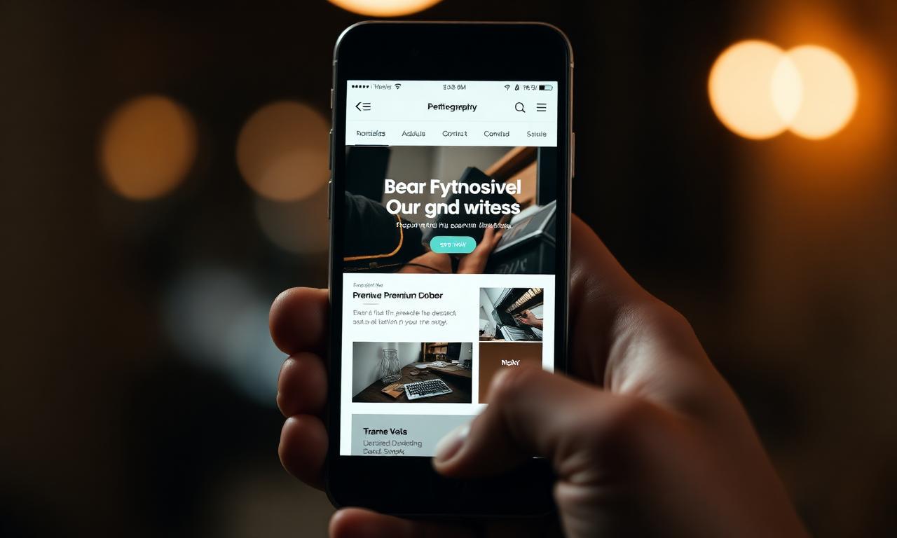
Mobile is no longer the smaller version of your website — it is the version most of your customers will ever see. Treat it as the primary experience and your enquiry numbers tend to take care of themselves. Treat it as an afterthought and even brilliant desktop design quietly leaks revenue every day.
Introduction
Many businesses still design and approve their websites on a large desktop monitor. Their customers, however, are scrolling on a phone in a kitchen, a car park or a queue. The mismatch is one of the most common causes of underperformance we see.
Mobile Usage Statistics
Industry data from Statcounter and similar sources consistently shows that more than 60% of global web traffic — and over 70% in many UK service sectors — now comes from mobile devices. For local-intent searches the figure is even higher.
Mobile is also where the highest-intent moments happen: 'open now', 'near me', 'best in [town]' — the queries closest to a purchase decision are overwhelmingly mobile-led.
User Experience Matters
A great mobile experience is calm, fast and effortless. Buttons are big enough to tap without zooming. Forms are easy to fill with thumbs. Text is comfortable to read without pinching. None of this is glamorous — but all of it is the difference between an enquiry and a bounce.
Mobile SEO Benefits
Google has used mobile-first indexing for years, which means the mobile version of your site is the one being judged for rankings. Slow, awkward or broken mobile experiences are not just a UX problem — they are an SEO problem too.
Common Mobile Website Mistakes
Most mobile failures fall into a handful of repeat offenders.
- Hero images that take five seconds to appear on 4G
- Pop-ups that cover the entire screen on a phone
- Tiny tap targets that require precision to hit
- Forms that demand fifteen fields on a 6-inch screen
- Horizontal scrolling caused by oversized images or tables
Improving Mobile Conversions
The fastest wins come from reducing friction. Shorten forms. Add a sticky call-to-action bar at the bottom of the screen with a tap-to-call button. Compress hero imagery and use modern formats. Replace pop-ups with quieter prompts that respect the visitor's attention.
Future Trends
Expect mobile to keep gaining share, expect visitors to grow even less patient and expect AI-powered search experiences to surface mobile-optimised pages first. Building for mobile today is the closest thing to future-proofing a website that exists.
Conclusion
If you only test your website on one device, make it a mid-range Android over a slow connection. If it feels great there, it will feel great everywhere — and that is where most of your customers are waiting.
Frequently asked questions
Keep reading
All blogs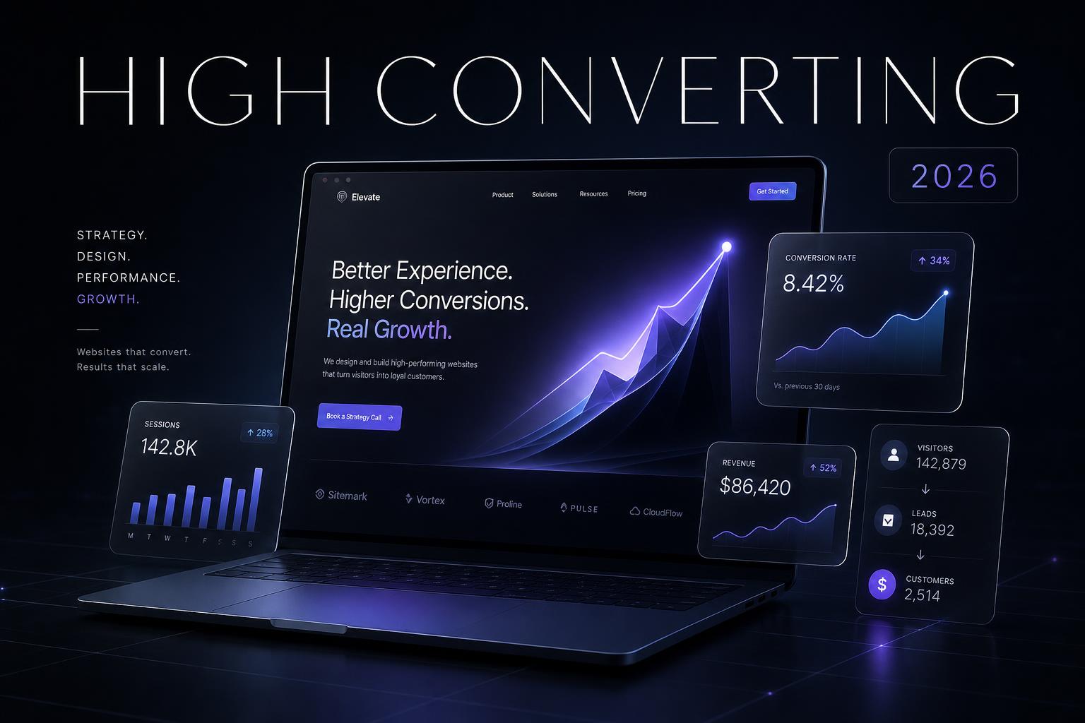 Web Design
Why Every Business Needs a High-Converting Website in 2026
Your website is no longer a brochure — it is the single most important asset in your business. Here is what separates a site that wins customers from one that quietly loses them.
 Web Design
5 Mistakes Businesses Make With Their Website
After auditing hundreds of UK business websites, the same five mistakes show up again and again — and each one is quietly costing leads every single day.
 Web Design
Why Slow Websites Lose Customers
Every additional second of load time costs you conversions, rankings and trust. Here is what really makes a website fast — and why most businesses get it wrong.