
The Importance of Mobile-First Website Design
Most of your visitors are on a phone. Most websites are still designed for a desktop. Here is why mobile-first is no longer optional.
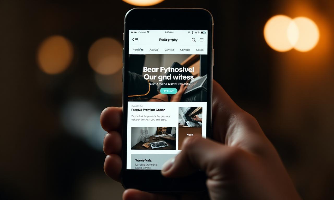
Mobile-first design used to be a slogan. In 2026 it is a measurable competitive advantage. Google indexes the mobile version of your site first, customers judge you on their phones first and yet most small business websites are still quietly designed on big monitors for desktop habits that no longer exist.
Where your visitors actually are
UK web traffic is now overwhelmingly mobile. For local services, the share regularly climbs past eighty per cent. The phone is the default device for searching, comparing and deciding — desktops mostly appear later, if at all.
Designing for desktop first and 'shrinking' for mobile produces sites that feel acceptable on big screens and frustrating everywhere else. Mobile-first inverts that priority.
What changes when you design mobile-first
Mobile-first forces discipline. With less room, every element must justify itself.
- Shorter, punchier headlines
- Buttons sized for thumbs, not mice
- One clear action per screen
- Faster loads, because every kilobyte is felt
- Navigation that hides cleanly rather than spilling everywhere
The SEO consequence
Google's index has been mobile-first since 2019. The mobile version of your site is what gets crawled and ranked — not the desktop version. If your mobile experience is poor, your rankings will be poor, regardless of how the site looks on your laptop.
Core Web Vitals — Google's user-experience metrics — are measured on mobile devices. Slow, jumpy or hard-to-tap pages are now a ranking penalty as well as a conversion problem.
“Your desktop site might be the version you are proud of. Your mobile site is the version that decides whether you grow.”
The mistakes we see most often
Even sites that claim to be mobile-friendly often fall into the same traps: enormous hero videos, sticky banners that cover half the screen, contact forms that require a magnifying glass, and tap targets crammed together so closely that mis-clicks are inevitable.
How to make your site mobile-first today
Open your homepage on your own phone, on 4G, with the brightness halfway down. Time how long the first useful content takes to appear. Try to tap every button with your thumb while walking. Read the page out loud. Most of the problems will surface in the first thirty seconds.
From there, fix in this order: speed, hierarchy, tap targets, forms, navigation. That sequence resolves around eighty per cent of mobile pain on most small business sites.
Frequently asked questions
Keep reading
All blogs Web Design
7 Signs Your Business Website Needs a Redesign
If your website is doing any of these seven things, it is costing you customers — and the longer you leave it, the more expensive it gets.
 Web Design
How to Choose the Right Website Design Agency
A website is one of the most consequential purchases a small business makes. Here is how to choose an agency you will not regret six months in.
 Web Design
The Essential Pages Every Business Website Needs
Skip these pages and visitors quietly leave. Build them well and your website starts doing real work.