Why Customers Judge Your Business in Less Than 5 Seconds
Your website creates an impression before a customer ever speaks to you. Learn why those first few seconds can determine whether someone becomes a customer or leaves.
Before a visitor reads your headline, before they understand what you do, and long before they consider picking up the phone, their brain has already made a judgement. Modern research suggests it takes less than five seconds — often less than one — for a person to decide whether a website feels credible. That decision shapes everything that follows.
Introduction
Most business owners assume customers weigh up websites carefully — comparing services, reading paragraphs and studying credentials. The reality is far less flattering. Visitors arrive with high expectations, low patience and a finger hovering over the back button.
This article unpacks how that first impression is formed, what visitors are subconsciously looking for, and the practical design decisions that earn trust in the opening seconds.
The Psychology of First Impressions
Psychologists call it 'thin-slicing' — the brain's habit of forming reliable judgements from tiny samples of information. Online, a hero image, a font choice and a colour palette are all your visitor needs to form an opinion about your business as a whole.
This judgement is emotional first, logical second. A visitor does not consciously think 'the line-height is generous and the contrast is high'. They simply feel that the brand looks confident, calm and worth their time — or that something is slightly off.
“People do not decide whether to trust your business after reading your site. They decide whether to read your site after trusting your design.”
What Visitors Notice First
Eye-tracking studies consistently show that visitors anchor on a handful of elements before doing anything else. Most websites neglect at least one of them.
- The hero headline — does it name an outcome they care about?
- The main image or video — does it look professional and on-brand?
- The primary call to action — is it visible and unambiguous?
- Whitespace and rhythm — does the page feel calm or cluttered?
- Loading speed — does the page appear instantly, or stutter into view?
Design Mistakes That Hurt Trust
Trust is rarely lost by one dramatic failure. It is lost by a small accumulation of details that quietly signal 'amateur'. Stock photography that everybody recognises, inconsistent fonts across the page, awkward spacing on mobile and tired colour palettes all chip away at credibility before a visitor has read a single word.
Equally damaging are the patterns that feel pushy — autoplay videos with sound, immediate pop-ups, cookie banners that obscure half the screen and contact forms with fifteen fields. Each one tells the visitor that their experience is secondary to your conversion metrics.
Building Instant Credibility
Credibility in the opening seconds is built on three foundations: clarity, polish and proof. Clarity means the visitor immediately understands what you do and who it is for. Polish means the design choices feel deliberate and consistent. Proof means there is at least one tangible signal — a logo, a testimonial, a number — that other people have already trusted you.
When those three signals align, the visitor's nervous system relaxes. They begin to read properly, scroll deeper and consider the offer in front of them. Without them, no amount of clever copywriting further down the page can recover the lost ground.
Examples of Strong First Impressions
The best landing pages share a common discipline: they say one thing, clearly, with confidence. A single headline that names the outcome. A single image that supports it. A single call to action that makes the next step obvious.
By contrast, weaker pages try to say everything at once — features, awards, social links, blog teasers and a chatbot — all competing for attention in the same fold. The visitor experiences this as noise, even if every individual element is well designed.
How Blackridge Digital Helps Businesses Stand Out
At Blackridge Digital we treat the first five seconds as the most important real estate on a website. Every project starts by stripping the hero back to one promise, one image and one action — and only then layering in the supporting story.
The result is websites that feel calm rather than cluttered, expensive rather than busy, and chosen rather than tolerated. Our clients consistently report a noticeable shift in the quality of enquiries — not just the volume.
Conclusion
Your website's first five seconds are doing real work whether you have designed for them or not. The question is simply whether they are working for you or against you. Treat that opening moment with the same care you would give a face-to-face meeting and your conversion rate will follow.
Frequently asked questions
Keep reading
All blogs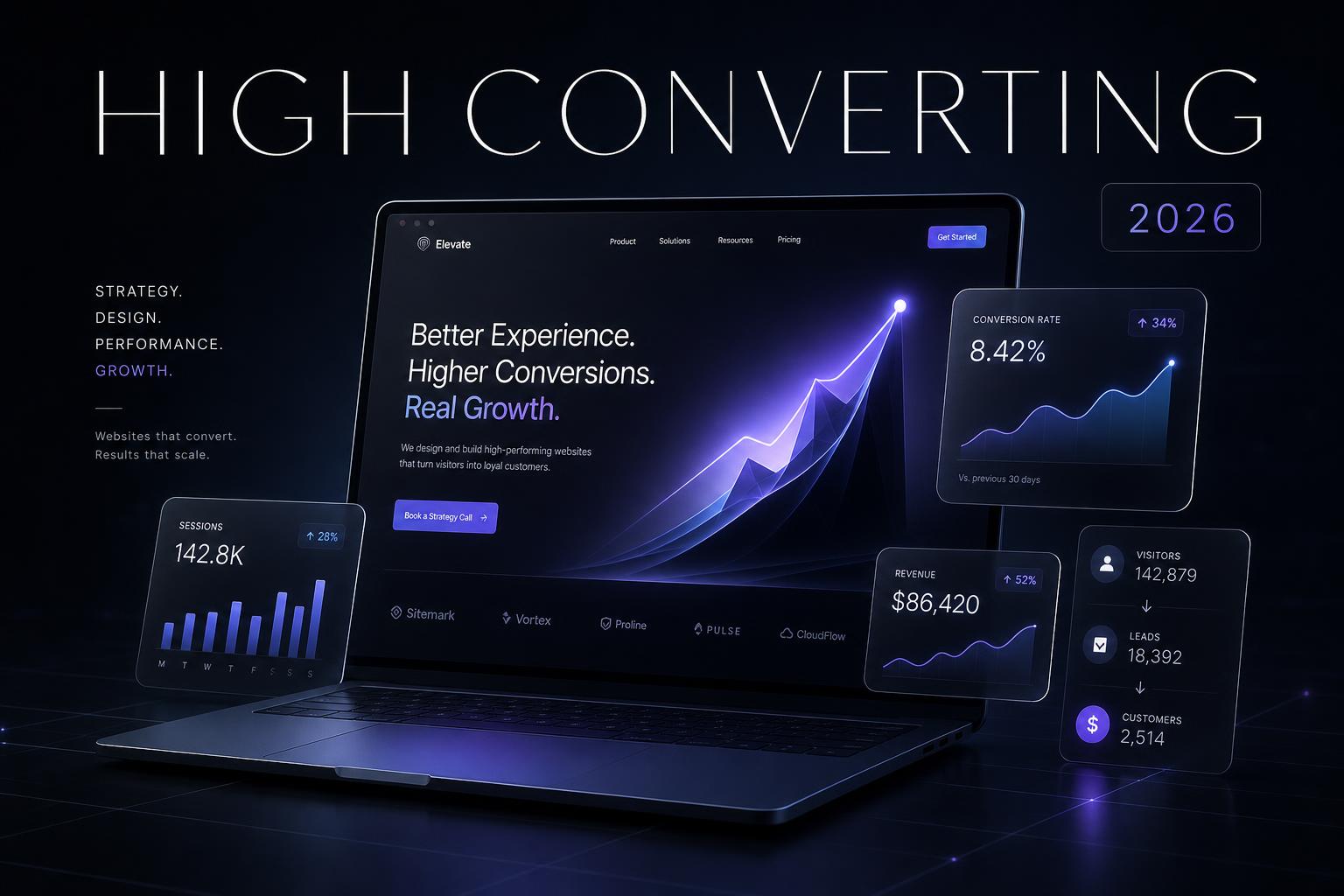 Web Design
Why Every Business Needs a High-Converting Website in 2026
Your website is no longer a brochure — it is the single most important asset in your business. Here is what separates a site that wins customers from one that quietly loses them.
 Web Design
5 Mistakes Businesses Make With Their Website
After auditing hundreds of UK business websites, the same five mistakes show up again and again — and each one is quietly costing leads every single day.
 Web Design
Why Slow Websites Lose Customers
Every additional second of load time costs you conversions, rankings and trust. Here is what really makes a website fast — and why most businesses get it wrong.